

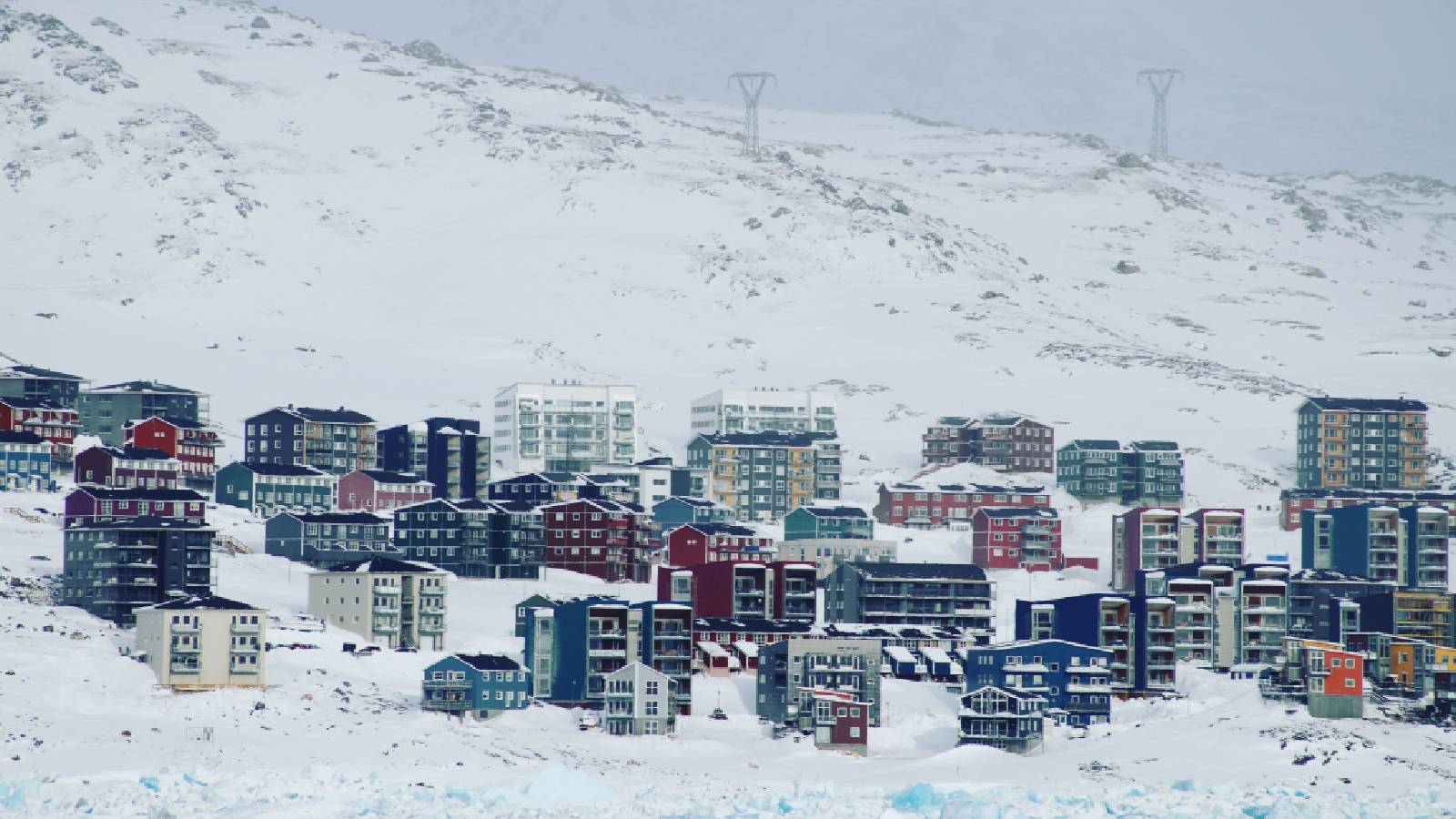


American dream of having Greenland is not new. For the US, Greenland is not just a land. It is a strategic asset located between North America and Russia, and that’s why the US is running a military base there.
According to Trump, he needs the land ‘for defence’.
So, there's an add-on to Greenland’s story now. It is its size. The Mercator-style map shows Greenland as the biggest island, covering roughly 2.17 million square kilometers. It appears as massive as Africa.
But can you really trust what you see on a globe? What if the countries we think are huge are actually much smaller than they appear?
Redrawing the Map?
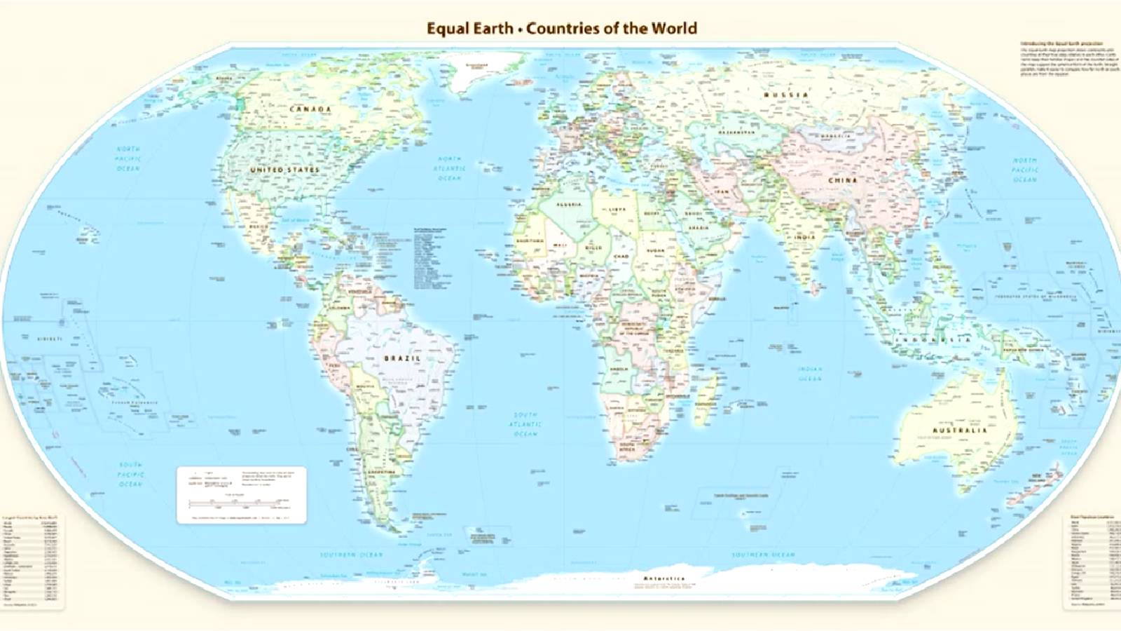
On September 4, the UN General Assembly backed an African-led resolution encouraging the use of Equal Earth and other equal-area map projections to represent the world's landmasses more accurately.
The resolution passed 164 -1, with six abstentions. The United States was the only country to vote against it.
Togo, which led the initiative, argued that the widely used Mercator projection exaggerates the size of regions near the poles while making Africa appear far smaller than it is. " Its ambition is simple: to promote a projection that better preserves the true proportions of continents, particularly Equal Earth Projections, including the Equal Earth projection preferred, of course, by the African Union," said Togo’s Foreign Minister Robert Dussey.
Where does Greenland come into this?
Greenland has become the most recognisable example of the distortion. That makes the island particularly interesting at a moment when it is already at the centre of another global conversation.
Greenland's strategic importance has grown as the Arctic opens up, drawing greater attention from the United States, Europe, Russia, and China. US President Donald Trump has repeatedly pushed the idea of greater US control over Greenland, while the European Union has moved to deepen its economic relationship with the territory and Denmark. The US continues to maintain Pituffik Space Base as part of its Arctic defence architecture.
China has self-proclaimed itself as a ‘Near-Arctic State’ and identifies shipping, resources, research and security among its Arctic interests.
Also, it sits near key Arctic waterways, including Baffin Bay and the Davis Strait, which connect the Arctic Ocean to the North Atlantic.
So how big is Greenland actually?
Greenland covers roughly 2.2 million square kilometres; Africa covers about 30 million square kilometres. That is, Africa is 14 times bigger than Greenland.
Even though Greenland is the world's largest island, most of it is covered by the Greenland ice sheet. Its enormous area does not translate into an equally large amount of habitable land, and its population is just 57000.
Mercator was never intended to show the true relative area of continents. Its main purpose was navigation. In that case, that distortion seldom matters. But now, that’s not the case; it is high time that the world and its borders be presented fairly.And that distinction matters.
No flat map can perfectly reproduce the surface of a spherical Earth. Every projection has to compromise on something - area, shape, distance, or direction.
In geopolitics, even though what matters is not simply how large a place appears on a map, but where it is, what it contains, and how strategically accessible it is, the boundaries matter.
The Maps we all grew up with
The Mercator projection is the map we use widely. It was created by Flemish cartographer Gerardus Mercator in 1569 and was designed for navigation and it allowed sailors to plot courses using straight lines.
To keep the angles correct on a flat map, Mercator had to stretch the grid lines wider as they moved away from the equator toward the poles.
The projection stretches landmasses increasingly as they get closer to the North and South Poles. Greenland, which sits far north of the Equator, is therefore dramatically enlarged on the map. Africa, on the other hand, lies much closer to the Equator and appears smaller than its actual size.
Then there is Peter’s world map, which was designed by German historian Arno Peters in the early 1970s. The projection prioritises accurate scale in some areas at the expense of shape, causing regions near the poles to appear distorted while areas closer to the Equator are stretched.
Flipped and shifted maps are also present. Some cartographers have even turned the map upside down, putting the South at the top, to challenge the idea that places in the Global South are somehow less important just because they are shown at the bottom. But the map can vary depending on where you are.
And then there is the map almost everyone recognises without thinking about it - the one on the UN flag. It places the North Pole at the centre, with the rest of the world spreading out around it. It uses an Azimuthal Equidistant projection.
Neither did Greenland shrink nor did Africa grow; what changed is the way we look at the world.